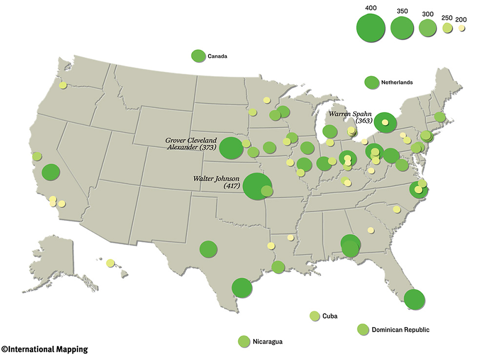
Maps tell stories and a lot of interesting conclusions can be drawn from them. Take a look at the one below, which shows pitchers with over 200 wins as a metric of longevity. The dots are clustered in the northeast with very little south of the Mason-Dixon line despite Texas, Georgia and Florida being hotbeds for baseball. California fairs no better relative to it’s population.
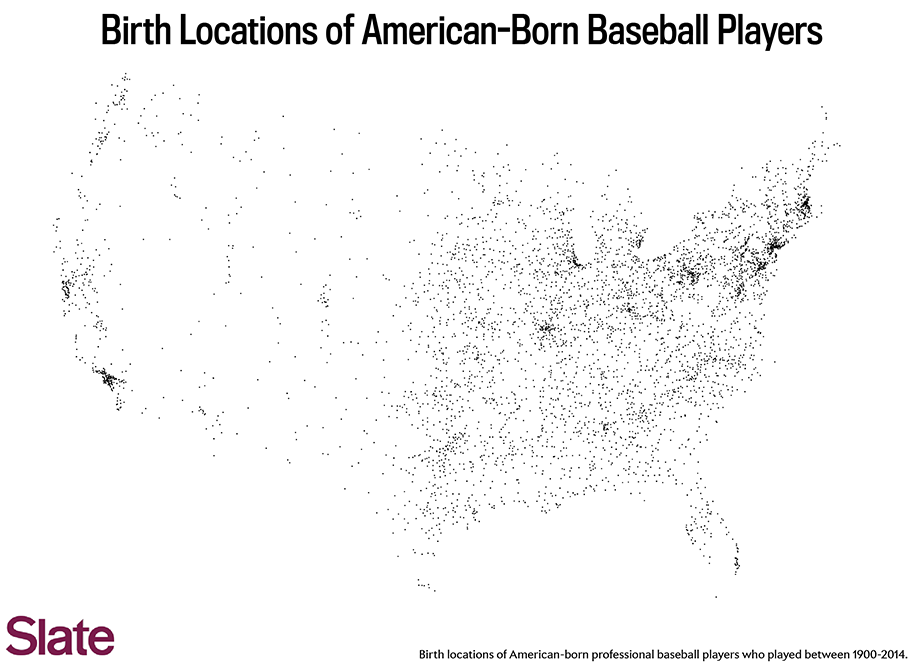
Compare where pitchers grow up to Slates‘ map of birth place locations, one of which is below and the southeast void is even more pronounced
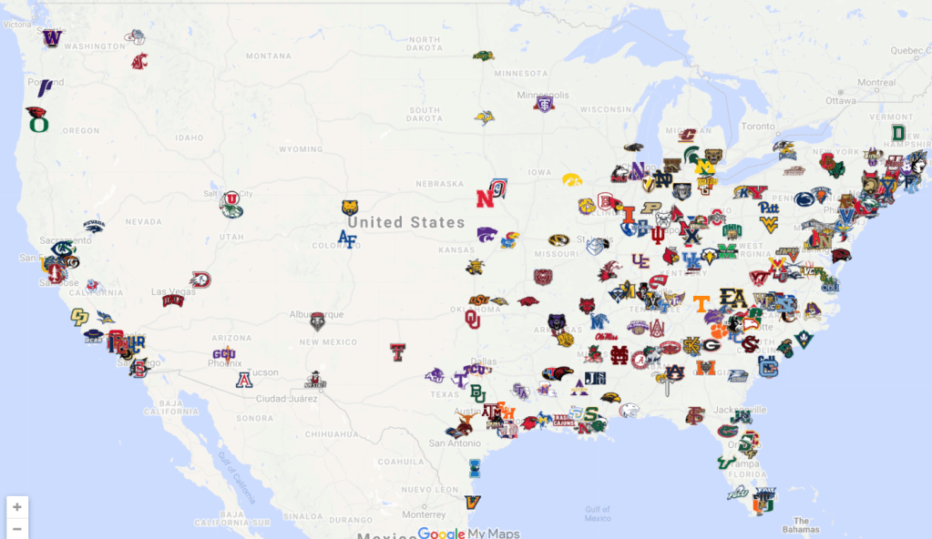
The geographic distribution of Division 1 baseball programs across the country from College Baseball Hub is pretty even with the baseball birth distribution, since it’s more driven by education than sports
Vox has several other baseball maps (across multiple sports) such as this one about MLB fan allegiance by geography
:format(webp):no_upscale()/cdn.vox-cdn.com/uploads/chorus_asset/file/2336596/facebook_mlb_map.0.png)
Also, look at this map of the top baseball training facilities.

One thought on “Baseball in Maps”